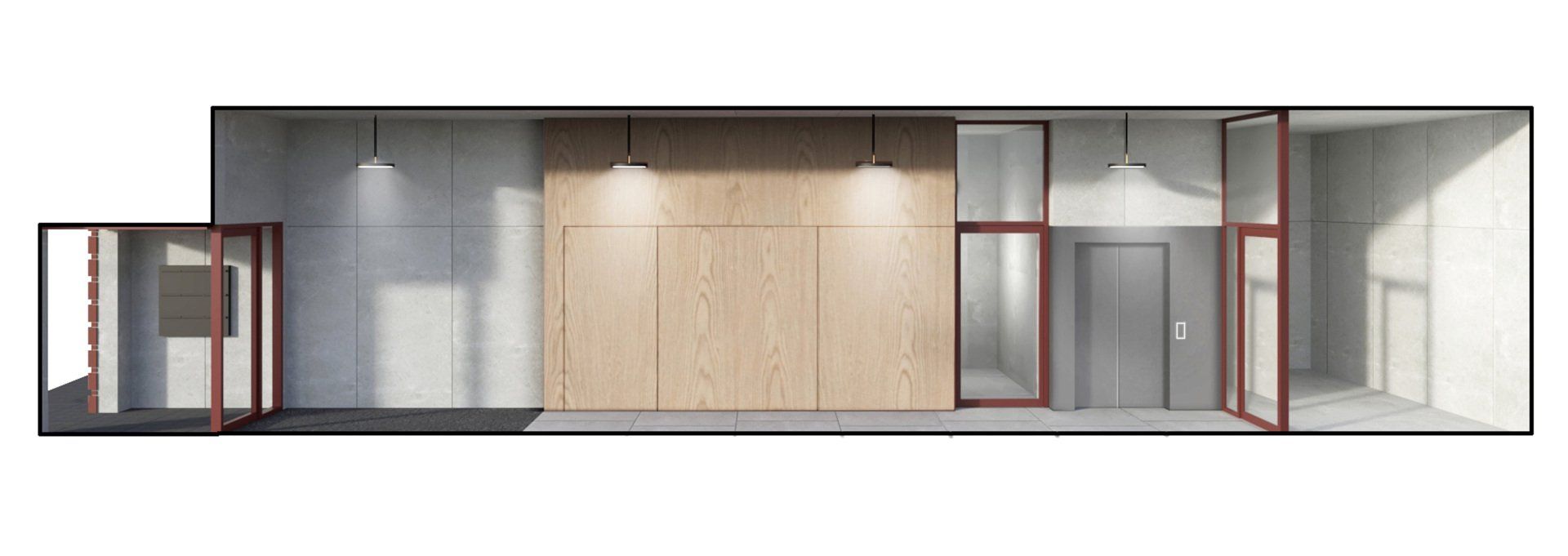
HKO HOUSING
Location: Amsterdam
Programme: 10 apartments, 1 commercial space
Status: Ongoing
Year: 2018 - Now
Client: Progress BV
Area: 1400 m2
Team: Jacco van Wengerden, Marco van Zal,
Matteo Porceddu, Luca Albertatio,
Nastassia Kustouskaya, Ries van den Bosch
In collaboration with Marco van Zal Architects
Structural Engineer: Van Eden bouwconstructies BV
Building Physics: HBA BV Het Geluidburo BV
Climatic Design Consult
-
TEXT
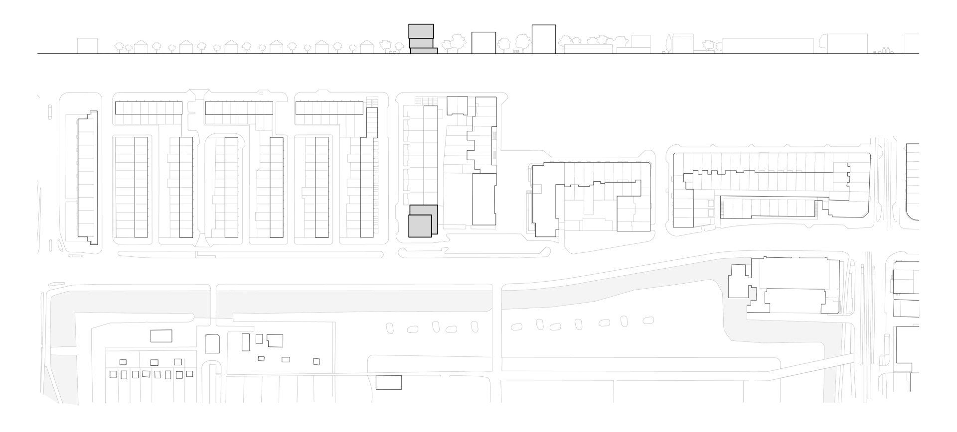
Kamerlingh-Onneslaan 40 was built as a post office in the 1960s as part of the Amsterdam Development Plan. It stands opposite an entrance to the Park-Frankendael and is located in an area that incorporates numerous architectural and planning waves, often within the same street.
This area was first developed in the late 19th century with ‘closed’ blocks of row houses built by different developers in different styles. This was followed by buildings that adhered to the clear lines of the Amsterdam School of the 1930s, then by the emphasis on light and openness that characterized the post-war period.
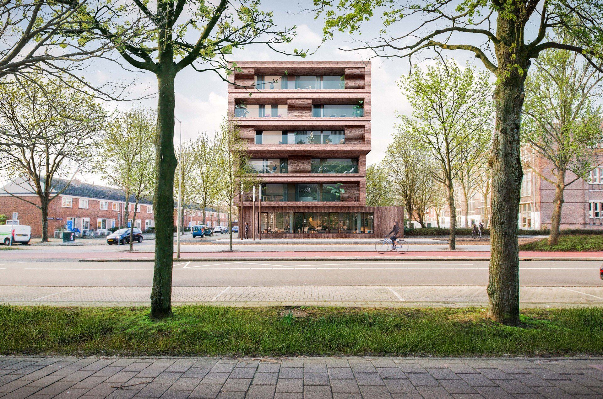
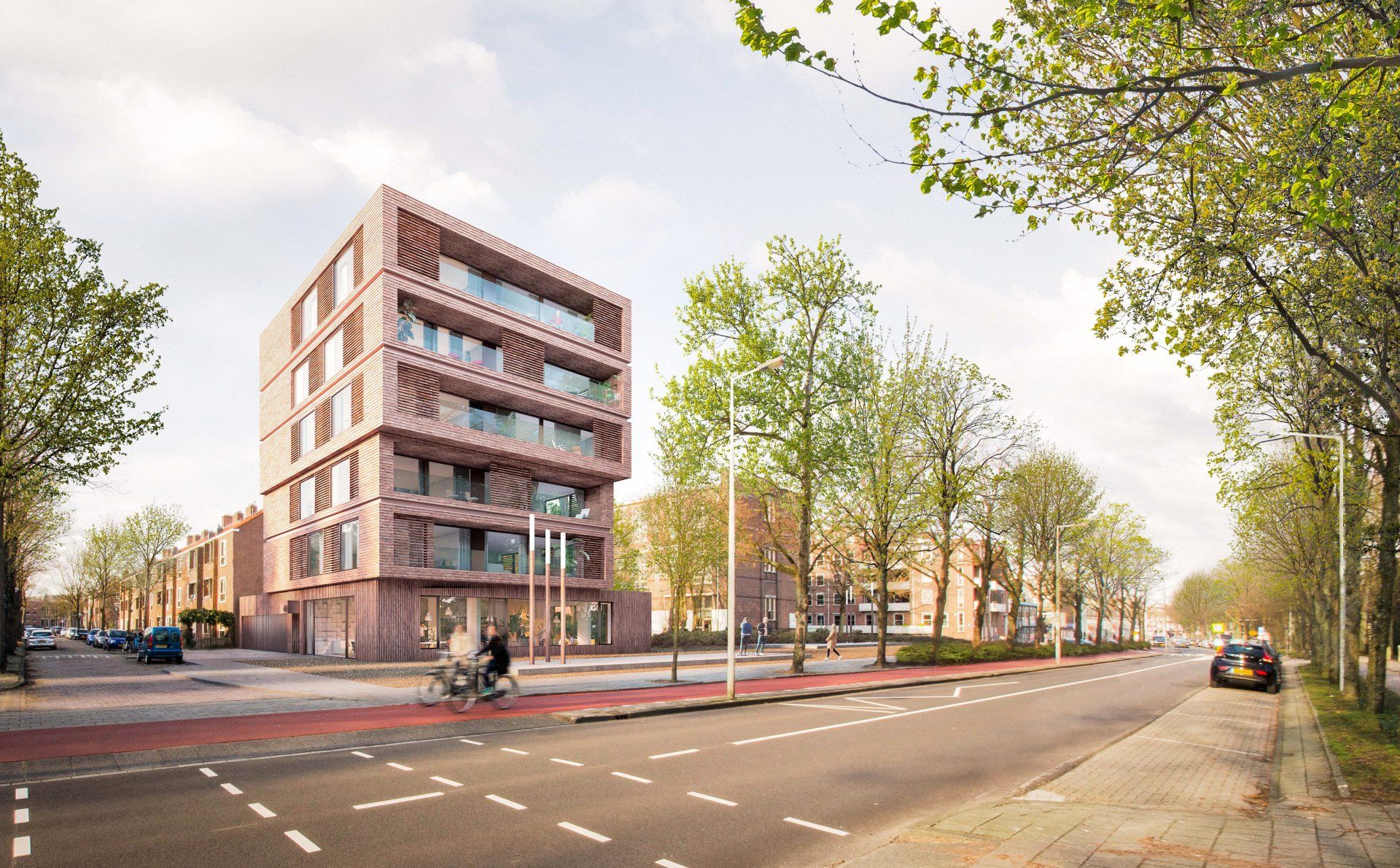
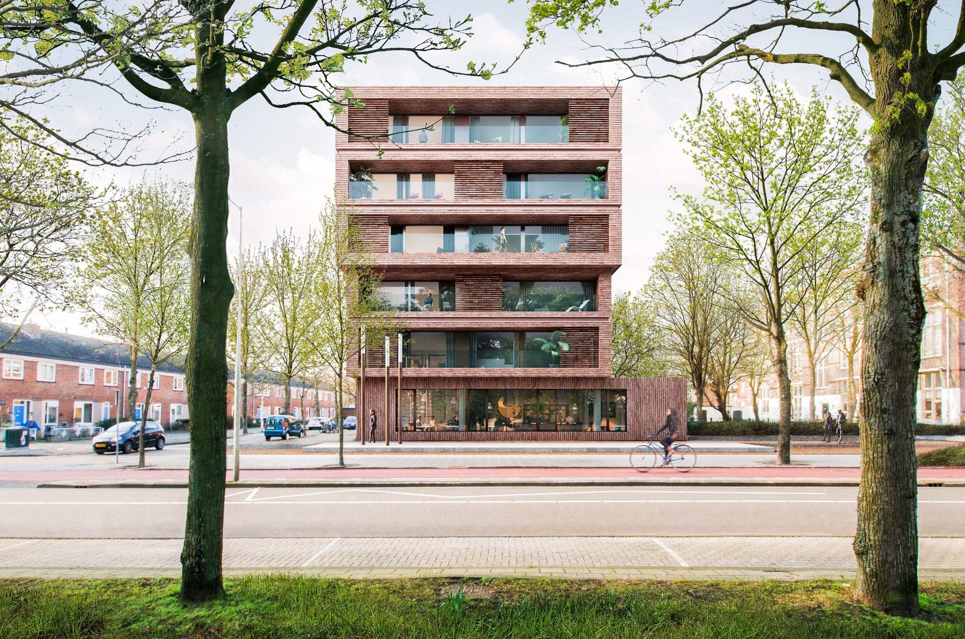
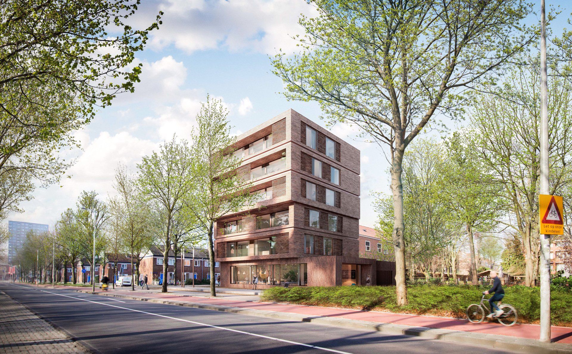
All these waves, which are still present, are materialized in the design Of the new six-storey building that includes 10 apartments and a commercial space on the ground floor. This materialization takes the form of elaborate brickwork to reflect the 19th century houses. the clarity of the facade the recalls the style of the 1930s, and the incorporation of post-war openness, light and quality of life. In this way, the new building acts as a stand-out new development on Kamerlingh-OnnesIaan.
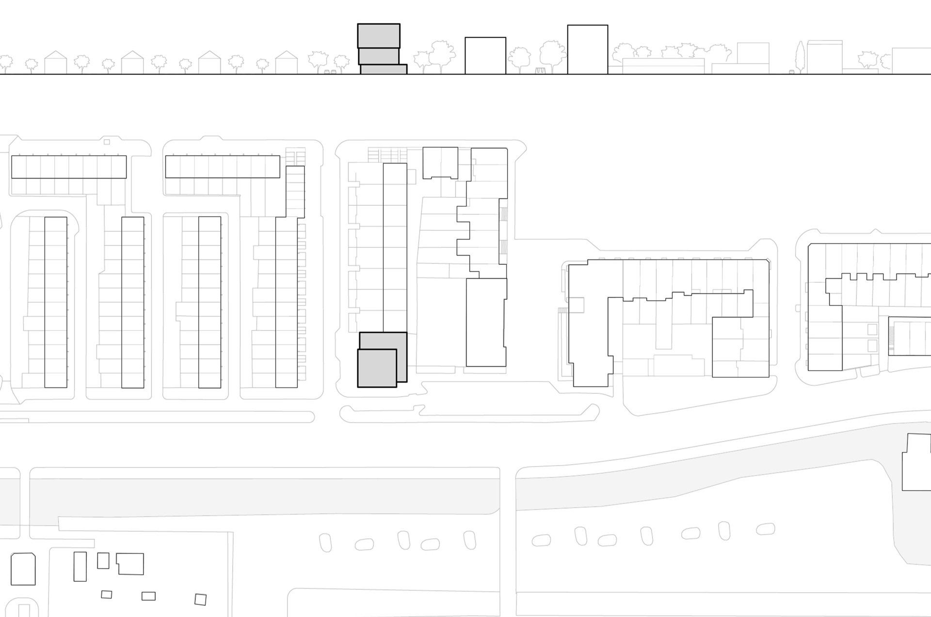
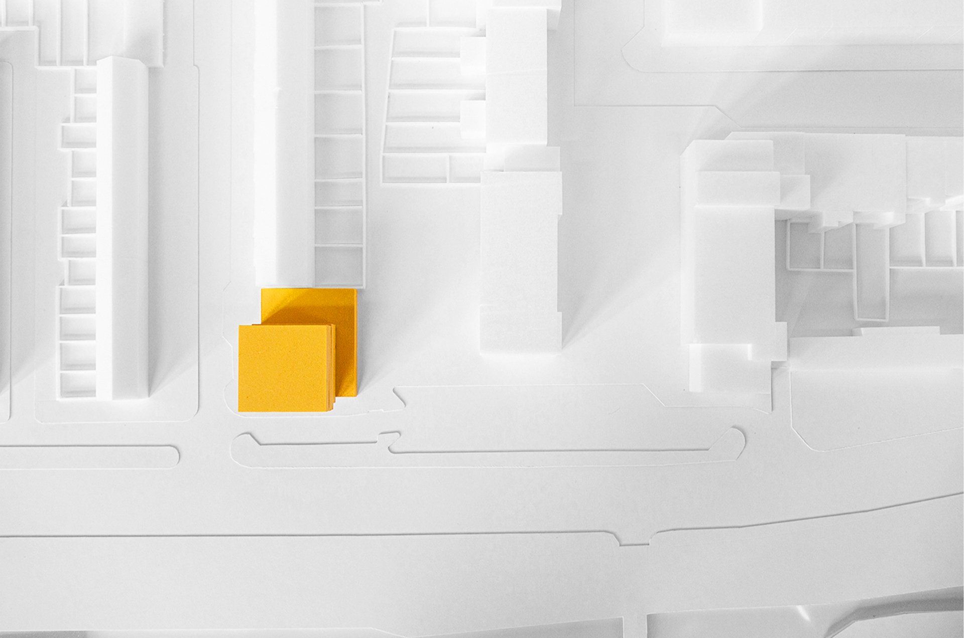
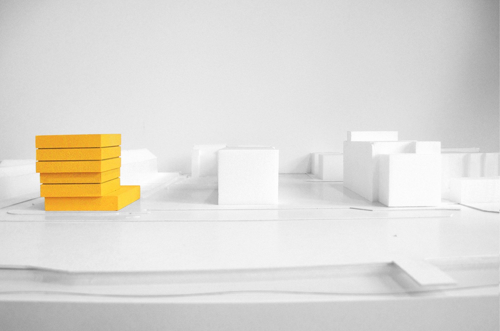
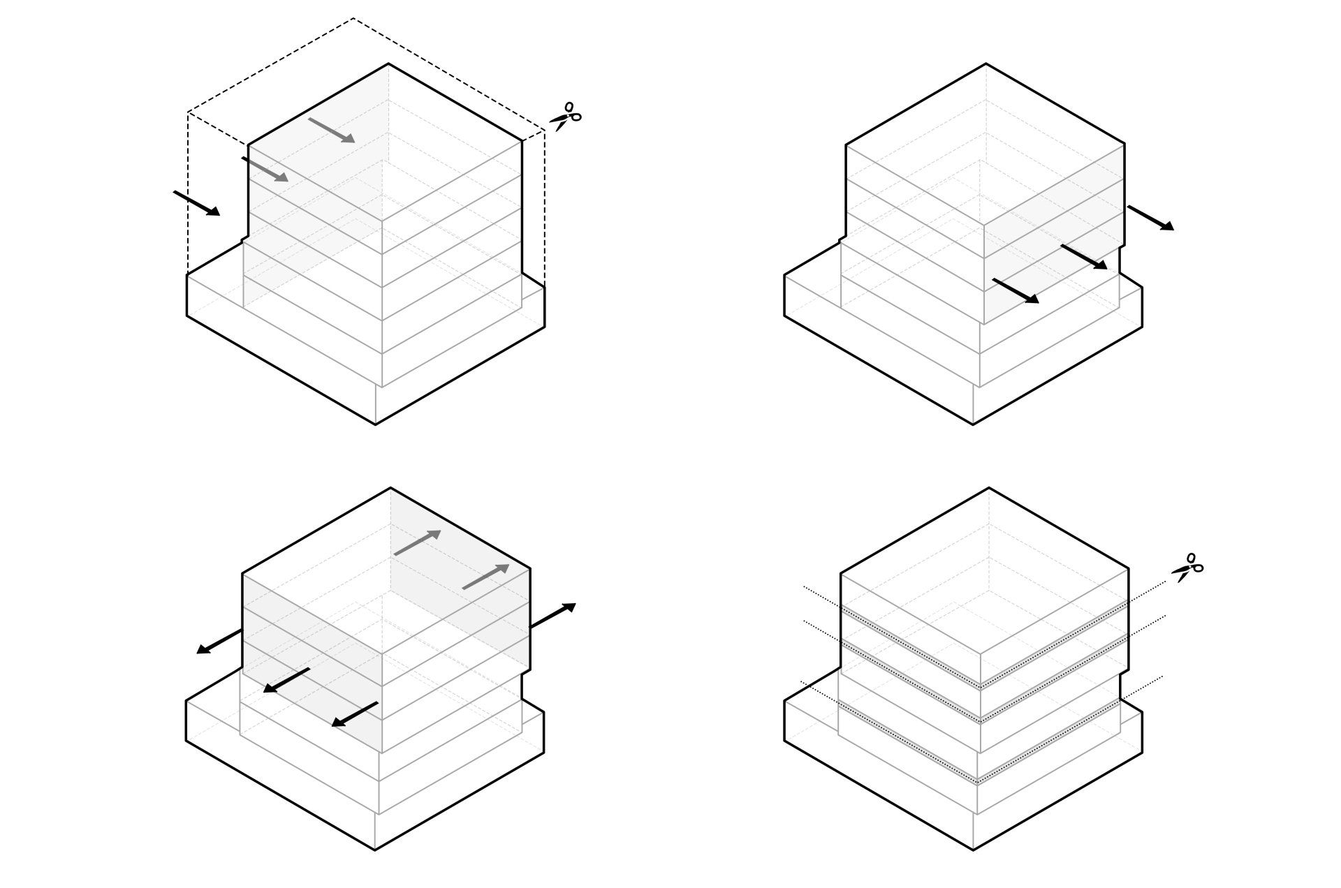
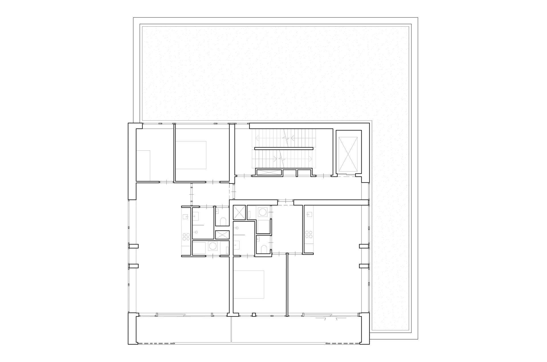
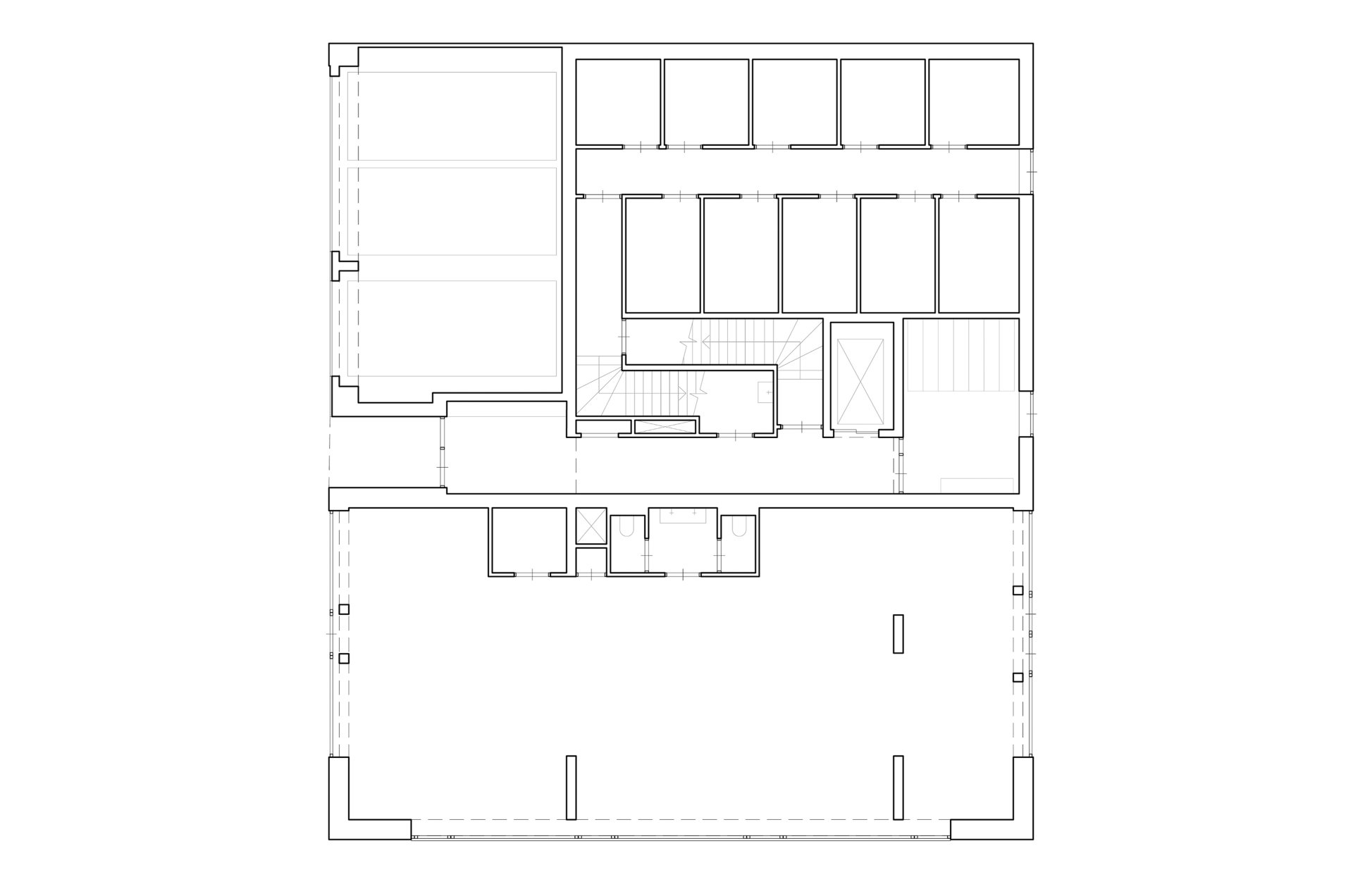
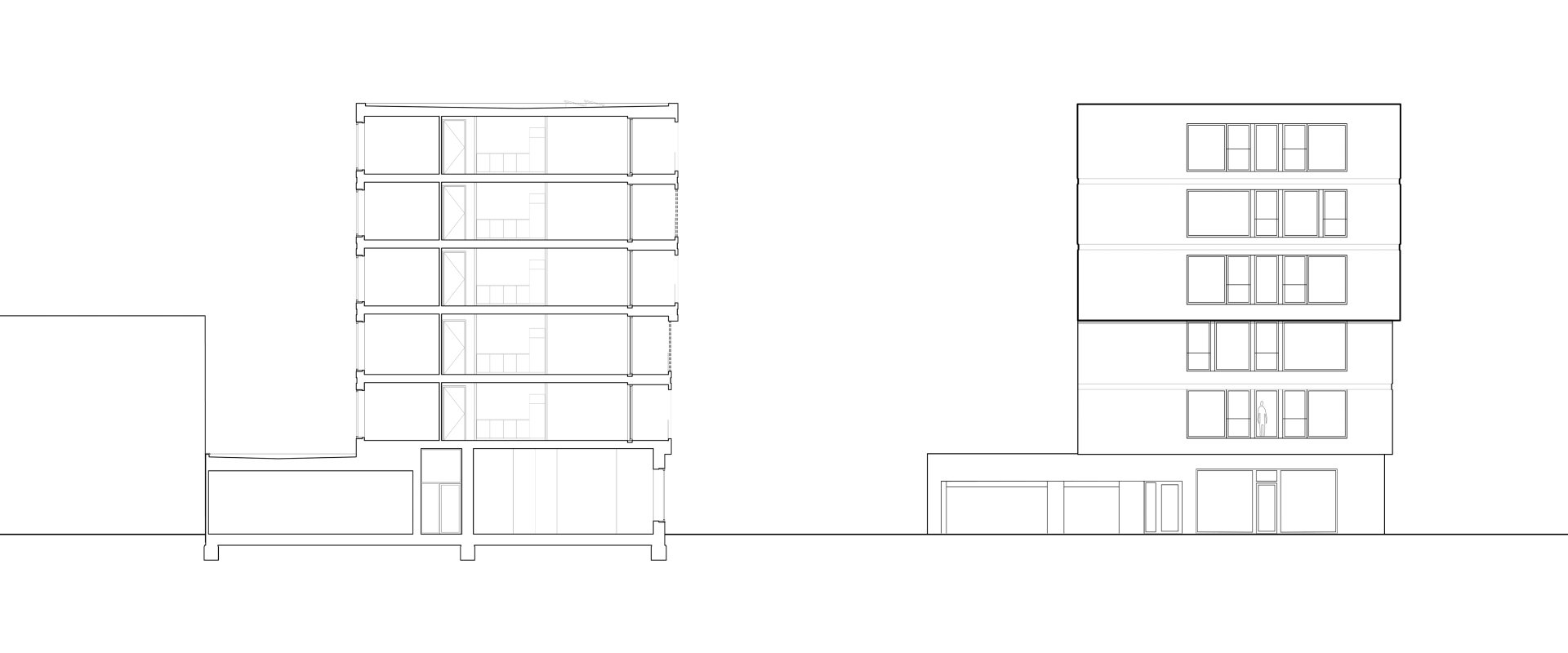
The building adds two more volumes to the original post office and is thus 'stepped' to the rear in order to ensure that nearby buildings are not deprived of light.
This stepped approach continues at the front of the building to create easier access to the commercial space and a link to the park. It is also applied to the sides for architectural coherence. Creating an attractive and open entrance to the park was a major design factor.
With this in mind, the existing parking bay has to be removed in order to create a public space that might also be activated by the commercial space on the ground floor.
Location: Amsterdam
Programme: 10 apartments, 1 commercial space
Status: Building application improved
Year: 2018 - Now
Client: Progress BV
Area: 1400 m2
Team: Jacco van Wengerden, Marco van Zal,
Luca Albertatio, Nastassia Kustouskaya,
Matteo Porceddu, Ries van den Bosch
In collaboration with Marco van Zal Architects.
Structural Engineer: Van Eden bouwconstructies BV
Building Physics: HBA BV Het Geluidburo BV
Climatic Design Consult
Kamerlingh-Onneslaan 40 was built as a post office in the 1960s as part of the Amsterdam Development Plan. It stands opposite an entrance to the Park-Frankendael and is located in an area that incorporates numerous architectural and planning waves, often within the same street. This area was first developed in the late 19th century with ‘closed’ blocks of row houses built by different developers in different styles. This was followed by buildings that adhered to the clear lines of the Amsterdam School of the 1930s, then by the emphasis on light and openness that characterized the post-war period.
All these waves, which are still present, are materialized in the design Of the new six-storey building that includes 10 apartments and a commercial space on the ground floor. This materialization takes the form of elaborate brickwork to reflect the 19th century houses.
The clarity of the facade the recalls the style of the 1930s, and the incorporation of post-war openness, light and quality of life. In this way, the new building acts as a stand-out new development on Kamerlingh-OnnesIaan.
The building adds two more volumes to the original post office and is thus 'stepped' to the rear in order to ensure that nearby buildings are not deprived of light. This stepped approach continues at the front of the building to create easier access to the commercial space and a link to the park. It is also applied to the sides for architectural coherence.
Creating an attractive and open entrance to the park was a major design factor. With this in mind, the existing parking bay has to be removed in order to create a public space that might also be activated by the commercial space on the ground floor.


